Browsing Tag

typography

Design

Design hero: Frank Pick

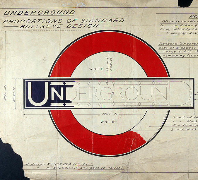
On my recent visit to the London Transport Museum, I was fascinated to see the design system and assets in one place, but also reminded how brilliant some of the graphic design – in particular the posters – has been over the years.

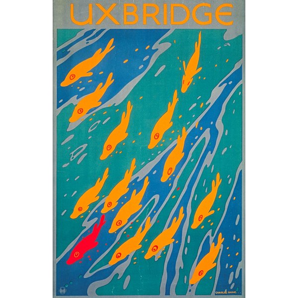
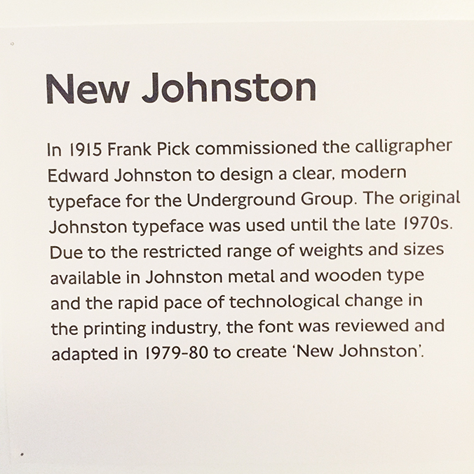
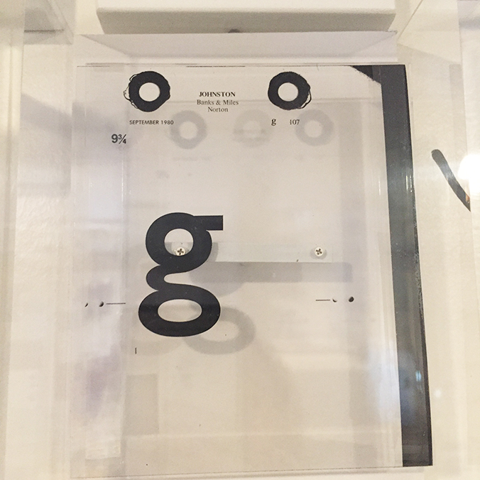
According to the Museum website, the modern graphic poster came into use in the 1890 and when Frank Pick was given responsibility for London Underground’s publicity in 1908, he recognised the potential of this powerful medium. Pick commissioned established artists such as John Hassall to design posters, and of course he went on to commission Edward Johnston to create the iconic typeface.

2002-399

Pick’s vision was that rather than focussing on the tube journey or transport, that people could be enticed to use the Underground by the attraction of the destination. This approach was soon adopted by bus and tram companies, featuring pictures of countryside scenes to encourage people to leave London for visits. Pick had a ‘passionate commitment to good design and an enlightened approach to the commercial application of art’, according to the London Transport Museum, and he commissioned artists and illustrators to fulfil his vision. Many younger and lesser-known artists went on to become famous.

5968_7

It is amazing that Pick trained and qualified as a solicitor, and as far as I can tell didn’t have any formal design qualifications. Yet his influence in steering the London Underground corporate identity, his vision in commissioning artists, illustrators and graphic designers and the establishment of an iconic brand language – the typography, the roundel and the visual style is still evident in London today, over 100 years since he first took on responsibility for the marketing of London’s Underground. Pick’s influence does not only extend over the graphic but also the architectural history of London.

“The test of the goodness of a thing is its fitness for use. If it fails on this first test, no amount of ornamentation or finish will make it any better; it will only make it more expensive, more foolish.” Frank Pick.
 

Save

Save

Save

Save

Design

Designology late debate, London Transport Museum

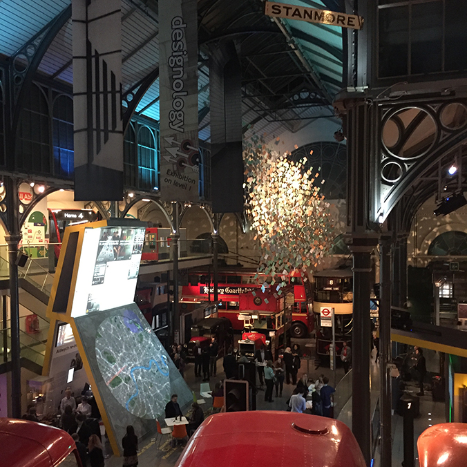
‘Designology’ at the London Transport Museum is a year-long programme of events, focussed around design and London’s transport – exploring how design makes London better. Subject matters include wayfinding, mapping, data, social behaviour, service design, street furniture design as well as branding and principles of one of the leading design systems in the world.

It’s been ages since I visited the London Transport Museum, so I was really pleased to go again, and booked specifically for the Late Debate, which also gets you entry to the Designology studios.

IMG_8560

Until you see all of the design system and principles together, you don’t fully realise how the persuasive identity of London’s transport system is actually, in large part, the visual identity and language of London.

All Londoners and visitors know the iconic typeface and brand assets, but seeing it there together, on signage, bus stops, and literature – in it’s earliest form and in modern digital – you get a true sense of how well this important London artefact has been cared for and protected, and how it is still as vital and relevent today as it ever was.

IMG_8551

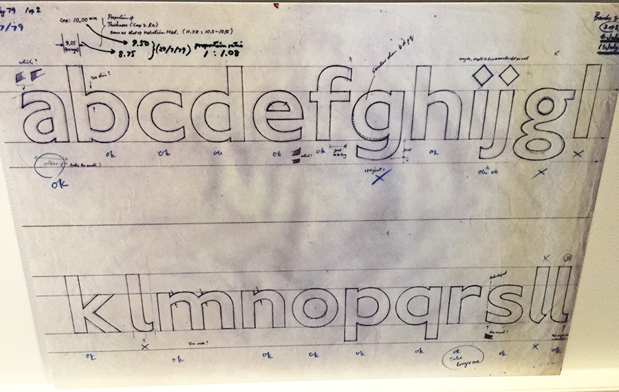
It was fascinating to see original handrawn/marked up fonts.

IMG_8565And seeing individual pieces of film brought back memories from my print design and production days.

IMG_8554

I don’t know if there is any urban design language that is as influential as the London one, or as recognisable. What struck me was also not just the very recognisable brand assets, but also the wealth of graphic design generated by or for London Underground/Transport for London over the years. That’s a whole separate post!

But to the debates. So, the talks started at 8pm for an hour, and there were 4 to choose from:

Off the rails: Expert historians, authors and contemporary designers explore designing for the railways, sharing from the past and debating recommendations for the future.
Secrets behind the Tube map: Tube obsessed Londonist Video Journalist Geoff Marshall to explores the history, anomalies and oddities of our much loved London Underground Map.
Delight and surprise: Explore how our journeys can be impacted through moments of delight and surprise, and how such moments make London a world class leader in design.
Connect or forget: New London Architecture and a panel of expert speakers consider how the Tube and wider transport network has the ability to connect or forget regions and communities.

We chose the ‘Delight and surprise’ stream and heard interesting presentations from the team who curate the Art on the Underground programme, a new innovative scheme to use plants and bio installations in tube stations, how advertising has changed over the years and about how events are an important element in community programmes. The presenters were very interesting, especially the Art on the Underground one, but it never really felt like a properly curated debate. There wasn’t really enough in the subject matter to debate and with an hour to cover 4 topics it didn’t feel like any went into enough depth to get a robust discussion going.

That said, I really enjoyed the evening. I got to spend time with my friend Paul, immerse myself in lovely design things and drink wine in a superb venue. What’s not to like 🙂


Save

Save

Save

Save

Save

Save

Save

Save

Save

Design

British Airways typography

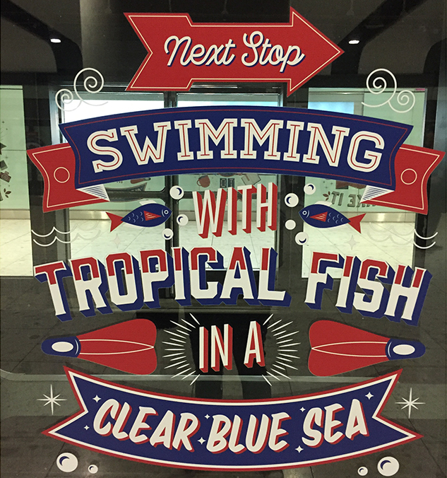
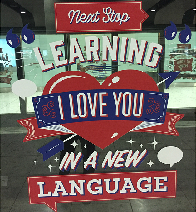
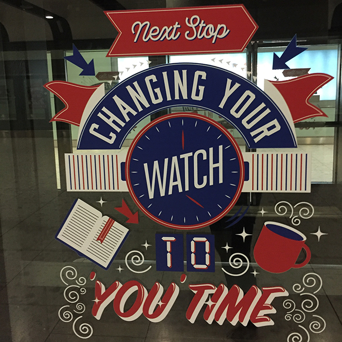
Loved these messages on the little shuttle train at Terminal 5.

IMG_8101

I really like this type style, with illustrations and a mix of fonts or handrawn elements.

IMG_8103

And using just a 3-colour palette really means they stand out, without looking too busy.

IMG_8102

Save

Design

Earls Court

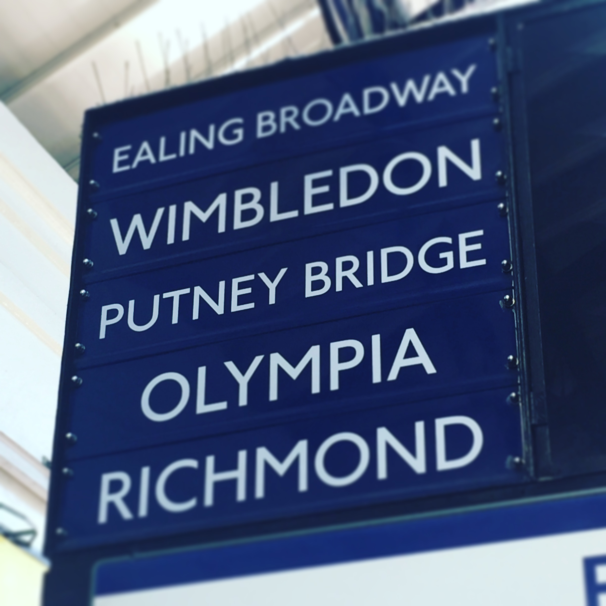
There’s so much fantastic typography all around you, sometimes you just have to look up to see it. This classic signage at Earls Court underground station is a great example of that.

Save

Save

Save

Save

Design

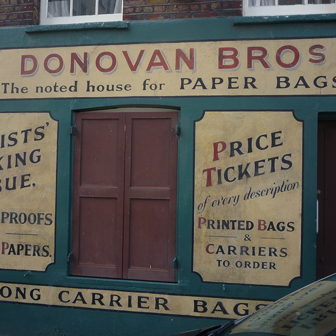
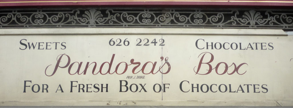
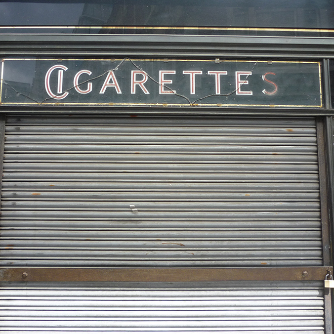
Paper bags, sweets and cigarettes

You can spot some amazing signage and typography around London if you look carefully enough. This company has been around for over 75 years, I don’t know if this signage dates back that far.

p1000313

p1000327

p1000328

Save

Save

Save